Bubble Babysitting
Bubble allows parents to find and book a babysitter who they may know through a mutual friend or point of interest.

Type
Private Sector
Tools
Sketching, Sketch App, Visual Studio Code
Duration
3 months
Deliverables
Product Design, Front End, Branding
Current State
- Parents in London had no reliable, on-demand way to find a trusted babysitter at short notice. Agency-led services were slow, expensive, and impersonal. Informal word-of-mouth networks worked, but they ran out quickly.
- Babysitters had no professional tooling. Work arrived through personal contacts, there was no way to manage bookings, and getting paid required awkward cash transactions.
- No platform had solved the trust problem in childcare at scale. The fundamental tension (would you let a stranger look after your child?) remained unresolved by every existing digital product in the space.
Desired State
- A purely mobile, on-demand experience that made trust visible through social graph connections. Parents could see exactly how a potential sitter related to their existing network, through Facebook friends, phone contacts, or school ties, rather than relying on an agency's vetting.
- Both sides of the marketplace operate through a single app. Parents find, book, track, and pay. Sitters manage availability, accept jobs, and get paid securely. No cash, no friction, no separate tools.
My Role
I was the lead designer on this project, working alongside the Bubble founding partners and the Shaping Cloud development team. The brief was to take Bubble from a concept to a fully designed, production-ready mobile product in roughly three months.
I owned the entire design process: user stories, journey mapping, wireframing, visual design, and brand identity. I also designed and built the marketing site in WordPress. The project ran across iOS and Android simultaneously, with a shared design language that had to work across both platforms without feeling like a compromise on either.
Defining the User Journeys
We started with a blank slate. Before any interface work, I spent time with the founding partners mapping out what both sides of the marketplace actually needed to do, and where those two sets of needs overlapped or diverged.
The social graph component was the most technically and conceptually challenging piece to map. Parents needed to see degrees of separation between themselves and any given sitter. We had to decide how to visualise that: how many steps of connection to surface, what constituted a meaningful link, and how to show it without overwhelming the booking flow.
It became apparent early on that sitter journeys and parent journeys were different enough that splitting them into two separate apps was a genuine option worth considering. Budget and scope ruled that out, but the tension shaped every navigation and mode-switching decision throughout the project.
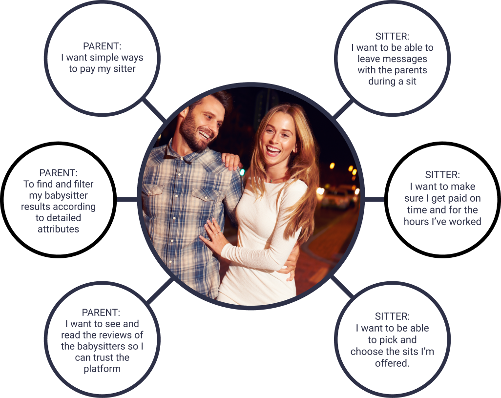
What Users Actually Needed
Before committing to a design direction, I mapped the functional and emotional needs from both sides of the app. Parents needed speed, trust signals, and visibility once a sit was under way. Sitters needed simple job management and a frictionless path to getting paid.
This exercise helped confirm where the two user types overlapped and where they diverged, and made it easier to argue for design decisions that might otherwise look like over-engineering.
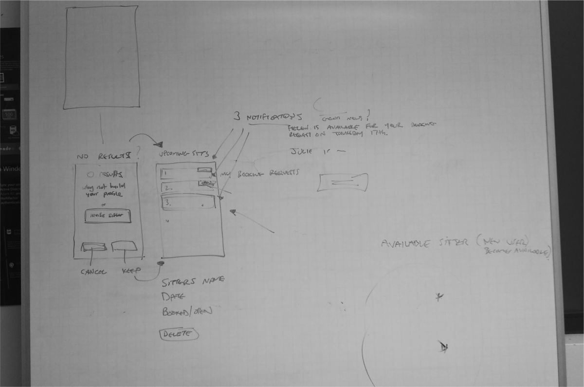
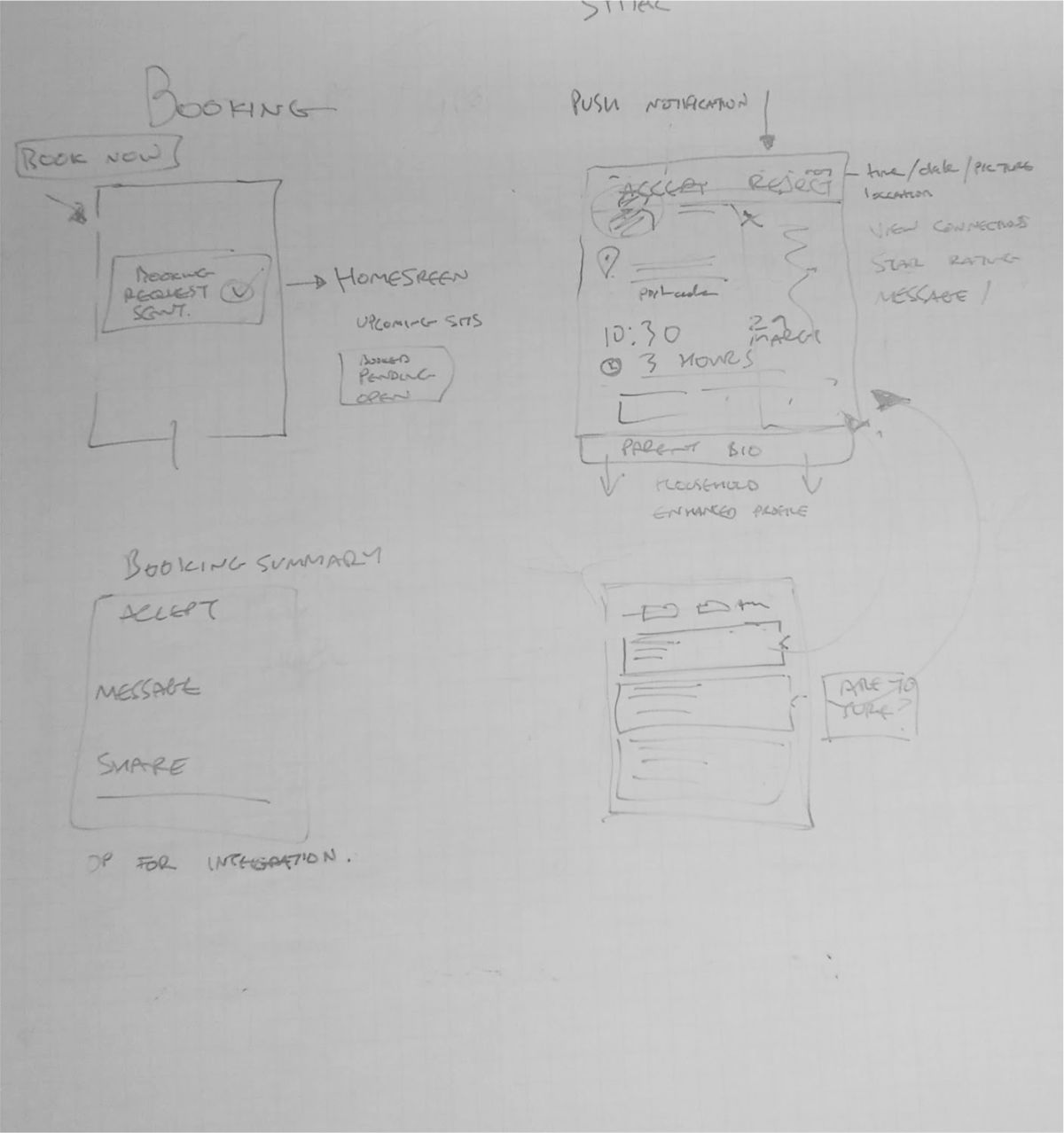
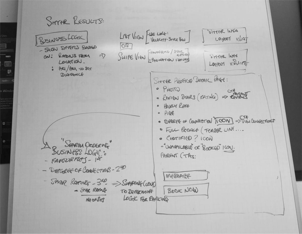
Wireframes and User Flows
With the key journeys agreed, I moved into wireframing. The parent and sitter flows required distinct approaches, even within the same interface. I mapped out multiple user flow solutions for each MVP feature before narrowing down.
The booking flow went through the most iterations. Sending a request to a single sitter, sending to a list, tracking acceptance in real time, and handling payment handoff at the end of a sit. Each step had edge cases the wireframes had to resolve before visual design started.
I also surfaced an important structural tension at this stage. The sitter user stories were so different from the parent user stories that I proposed splitting the app into two distinct experiences. The founding partners chose to keep them together for MVP, so I ensured clear in-app signposting to make the parent and sitter modes easy to distinguish.

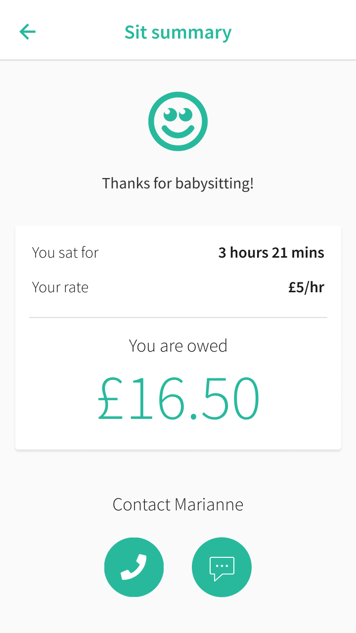
The Booking Experience
As a parent, you send a single booking request or a multi-booking request to a selection of sitters. Sitters choose which jobs to accept. The parent is notified when a request is confirmed. Every sit is tracked in real time, and payment is handled securely through the app at the end.
The design had to make trust visible at every step, from sitter search results surfacing shared connections through to the in-sit tracking screen that let parents message their sitter directly and track progress.


Ari Last, co-founder, TechCrunch 2016
"Users have the option of integrating their Facebook account with the app and allowing it access to their phone contacts. We show the user the entire chain of connection between them and the sitter."
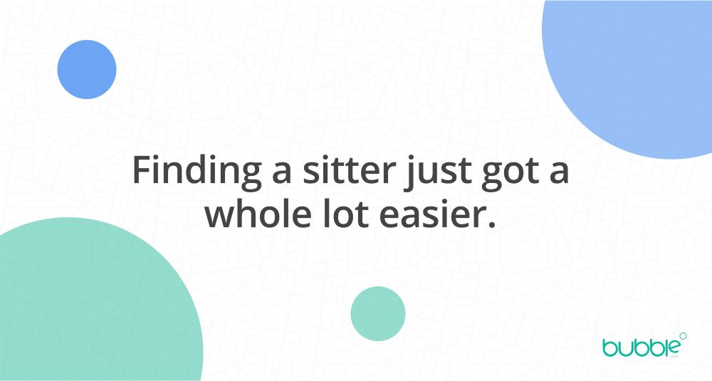
Brand Identity
The client had an early brand direction but wanted something fresher and more considered. I worked through colour, typography, and logo options, producing style tile setters to anchor the visual tone before moving into high-fidelity design.
The goal was professional but warm. Trustworthy without being clinical. A brand that parents would feel comfortable with and that sitters would feel proud to represent.

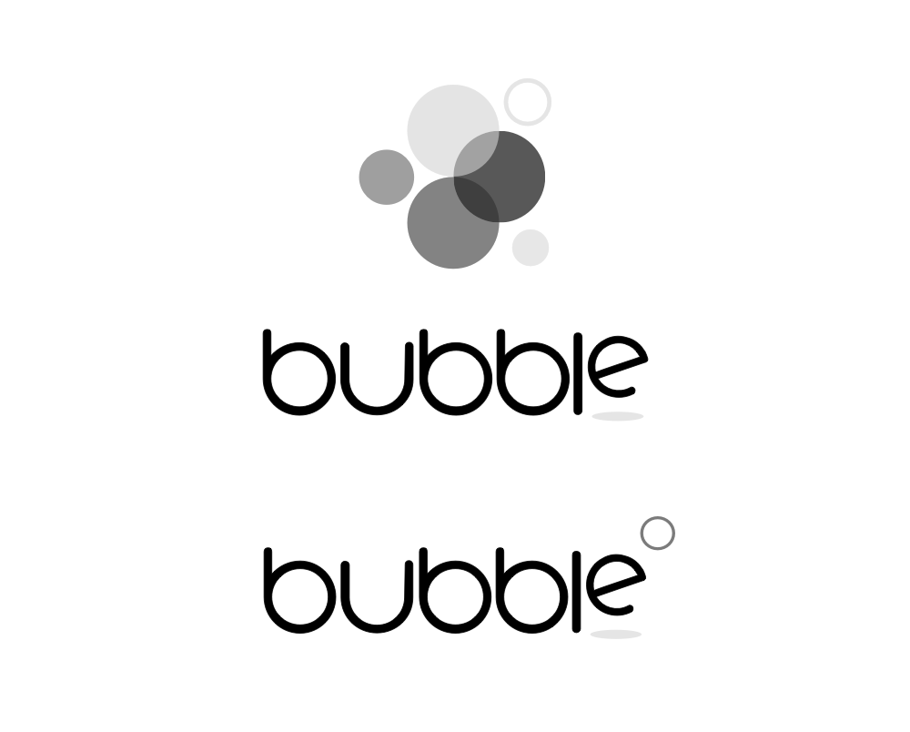
Bubble Logo
The Bubble logo is available in four variations: full colour and black and white versions for different use contexts. The overlapping bubble shapes and the 'degrees of connection' device were central to the identity, reinforcing the product's differentiator from the start.
A single-line wordmark handles tight spaces, and a minimal badge mark covers the most constrained contexts: app drawers, favicons, small print.


Bubble Brand Colours
Professional and approachable are not natural companions in a colour palette, but the Bubble green threads that needle. Warm enough to feel welcoming, considered enough to feel credible. The deep navy anchors it with substance.
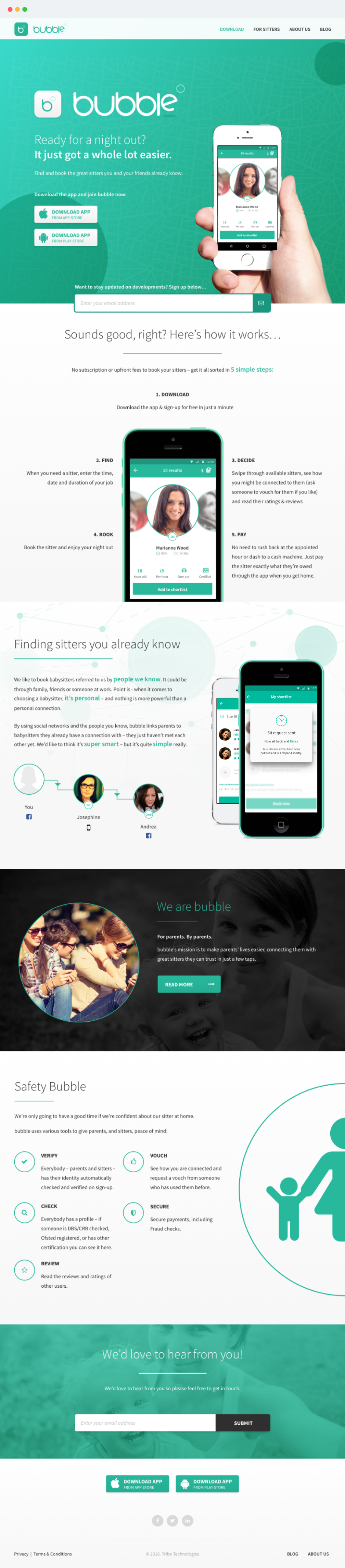
Marketing Website
Alongside the app, I designed and built the marketing site. The CMS was a heavily customised WordPress build using Advanced Custom Fields Pro, structured around reusable content modules rather than page templates, giving the founders the flexibility to update content without touching code.
Front end was built on Bootstrap 3 with hand-coded SCSS and JavaScript components. I developed locally with MAMP and Codekit, and used a Git branching setup to keep development, staging, and production cleanly separated.
App Icons
The app icon is the first piece of the product most users encounter. I led with brand colour, teal is immediately identifiable on a screen full of icons, and used the distinctive overlapping bubble mark rather than the full wordmark. Clean, bold, unmistakable.
The light and dark variants gave the icon flexibility across different store contexts and iOS home screen environments.
Results
The MVP launched in July 2016 on iOS and Android simultaneously, securing £175,000 in seed funding from angel investors including Mark Davies (ex-Betfair). Within the first ten days of open beta, over 300 users signed up and around 150 London-based babysitters joined the platform.
The social graph functionality became the product's defining feature. As co-founder Ari Last told TechCrunch at launch, showing parents the full chain of connection to a potential sitter was what made Bubble something genuinely new, not just another bookings app.
Bubble was featured in TechCrunch, Wired, The Daily Mail, and The Guardian, described as part of a new wave of apps working like "Tinder meets NCT" for parents.
" Bubble is such a smart way to quickly find trusted childcare. It’s giving parents back our flexibility and freedom. "
Signing off!
Key Takeaways
Trust Is a Design Problem, Not a Safety Problem
Every decision in the Bubble design ultimately came back to trust. Not legal trust (safety features, checks, policies), but felt trust. Would a parent feel confident enough to let this specific person into their home? The social graph was the answer to that question, but making it feel natural in the UI took real work. Surfacing degrees of connection without it feeling intrusive or surveillance-adjacent was the hardest UX problem on the project.
Two-Sided Marketplaces Demand Two Mental Models
Parents and sitters had fundamentally different relationships with the app. One was booking a service. The other was running a small business. I considered splitting the app in two early on, and while budget ruled it out, that tension shaped every navigation and information architecture decision. Designing for two distinct mental models in a single interface is significantly harder than designing for one, and I'd build in more time for that duality in future.
Bubble App Demo
See the Bubble babysitting app in action


