Crop Select
A SaaS web platform to track year on year yields of farmer crop growth.

Type
Public Sector
Tools
Sketching, Sketch App, Visual Studio Code
Deliverables
Product Design, Front End, Branding
Current State
Agricultural technology had created a paradox: while sophisticated tools existed for crop monitoring, adoption remained stubbornly low among the farming community. The challenge wasn't technical, it was systemic. Farmers ranged from tech-savvy operators using GPS drones to those preferring pen and paper, and yield prediction accuracy was limiting profitability and sustainability.
Agrimetrics emerged from the UK Government's £140 million Agri-Tech Strategy as one of four Centres for Agricultural Innovation, receiving an £11.8 million investment to become the national agri-data hub. Farms, research institutes and agri-food companies were generating vast quantities of data on yields, inputs, soils and management systems. Satellites and sensors promised to revolutionise collection. Yet without a centralised, trusted system to collate and analyse it all, that potential value was evaporating.
Desired State
Make the UK a world leader in agricultural data science by coordinating data from multiple sources into a unified decision-making tool that could serve farmers, researchers and policymakers alike. This meant building not just software, but an entirely new infrastructure for data integration and interoperability across British agriculture. Success required changing behaviour in a traditionally analogue industry resistant to new data collection methods, whilst delivering immediate, tangible value to individual farmers.
My Role
As product design lead working across a consortium of four founding partners, I drove strategic decisions that balanced user needs, technical constraints, and business viability. The complexity wasn't just designing an interface; it was creating a platform that could bridge the gap between cutting-edge data science infrastructure and farmers who might never have used a web application before.
Niab led knowledge exchange and outreach to farmers, positioning me at the critical intersection where academic data science met real farming operations. My approach centred on three principles:
1. Design for the least digital-literate user: Rather than optimising for power users, I designed for farmers who "could barely use a computer." This constraint forced clarity and simplicity that benefited all users, a principle that reduced support costs and increased adoption. When you're building something meant to serve the entire UK agricultural sector, you can't afford to leave anyone behind.
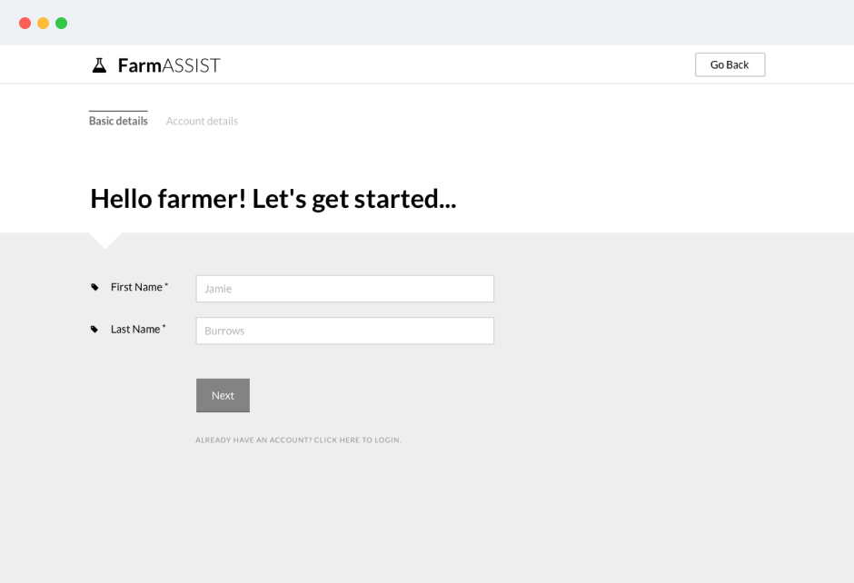
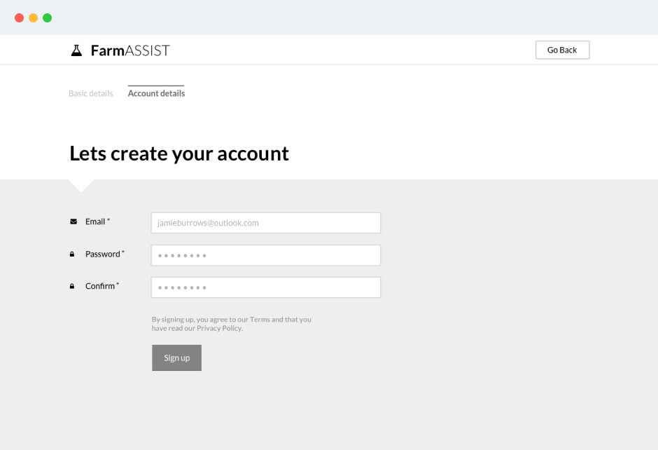
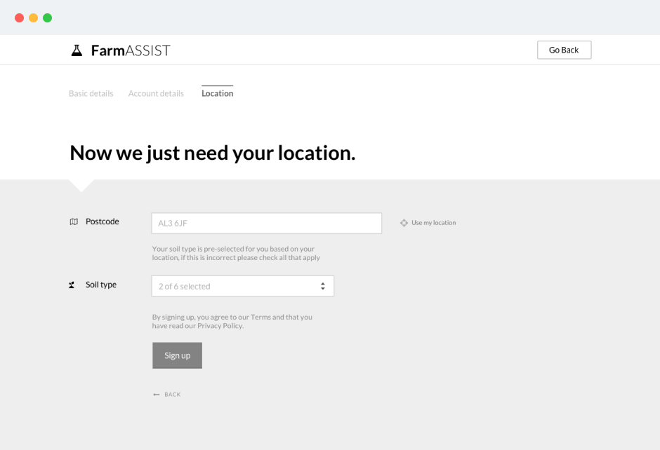
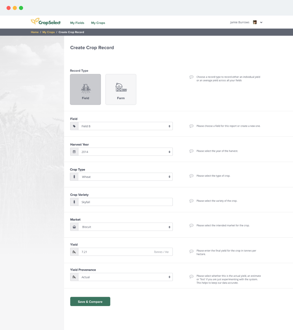
2. Minimise friction at critical adoption moments: I identified signup as the highest-risk conversion point. Through on-site research, I learned farmers abandoned complex onboarding. My solution: a 3-step signup that created immediate value before asking for extensive data, reducing time-to-first-value from 15+ minutes to under 2 minutes.
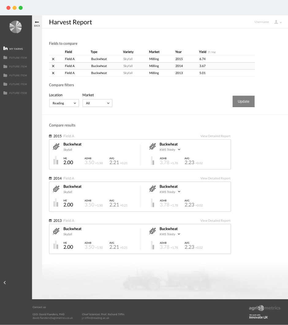
3. Build trust through transparency: Farmers were sceptical of sharing proprietary yield data. I designed anonymisation into the comparison feature's UI, making privacy protections visible and understandable, which became key to building the critical mass needed for meaningful benchmarking. Trust wasn't a nice-to-have. It was the foundation.
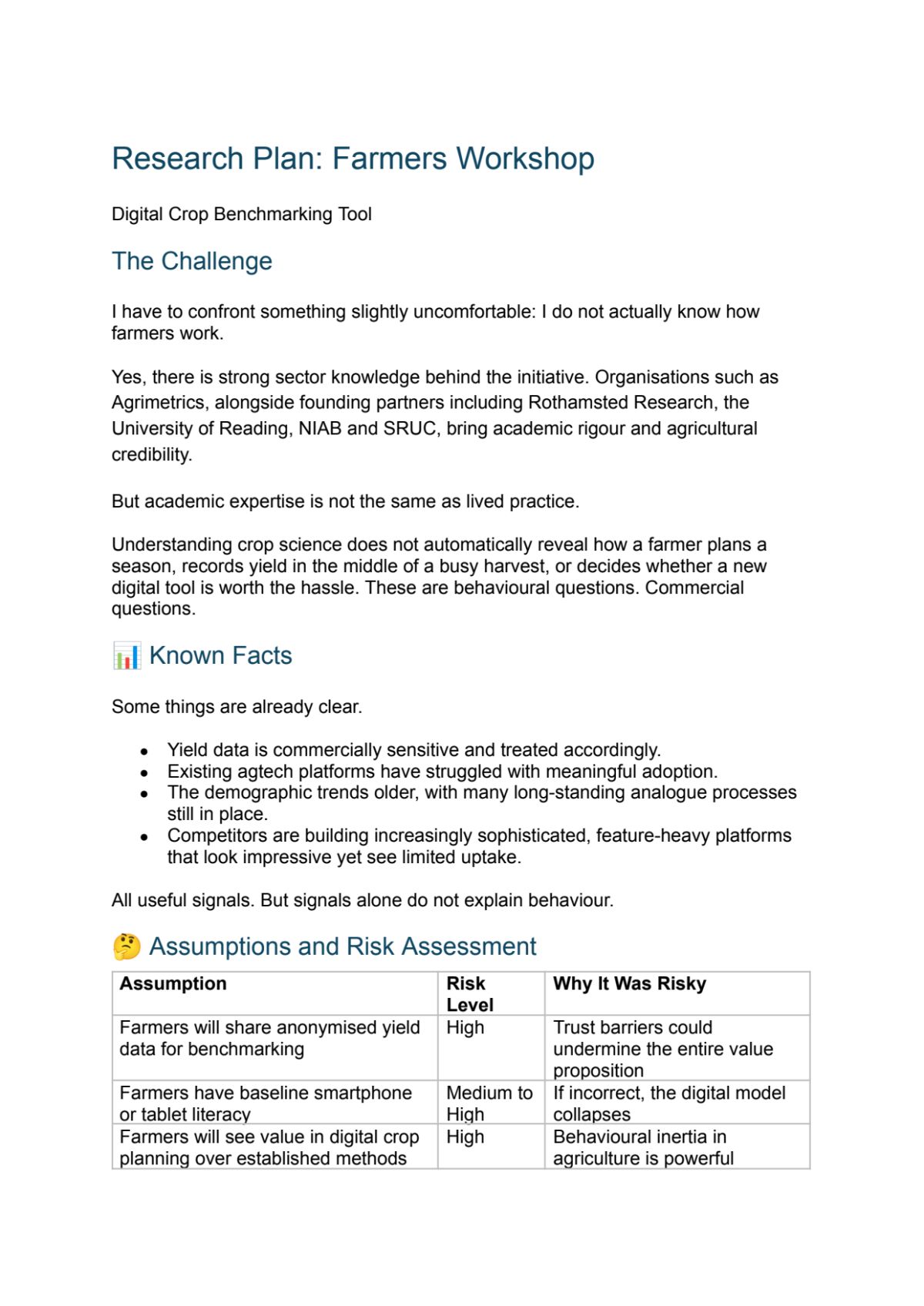
Research Plan & Farmers Workshop
Before committing to any design direction, I developed a comprehensive research plan to understand farmers' actual needs, behaviours, and pain points. This wasn't about validating what I thought I knew; it was about discovering what I didn't know I didn't know. The research plan structured sessions around three core areas: current data management practices, technology adoption barriers, and decision-making workflows during critical farming periods.
The farmers workshop itself became a revelation. Through card sorting and contextual inquiry, it surfaced a critical insight: the user base had extreme variance in technical literacy, from GPS drone operators analysing satellite feeds to those preferring pen and paper. One farmer told me he "could barely use a computer," yet he was running a profitable 800-acre operation.
This revelation forced a design principle: optimise for the lowest common denominator. Rather than building feature-rich tools for advanced users, I committed to radical simplicity. This constraint became the competitive advantage: competitors were building sophisticated but unusable tools. I would build something less powerful but actually used.
This early research prevented months of building the wrong product and established a decision-making framework for every subsequent feature debate. More importantly, it gave us farmer voices in the room whenever stakeholders pushed for complexity over clarity.
Jobs to be done
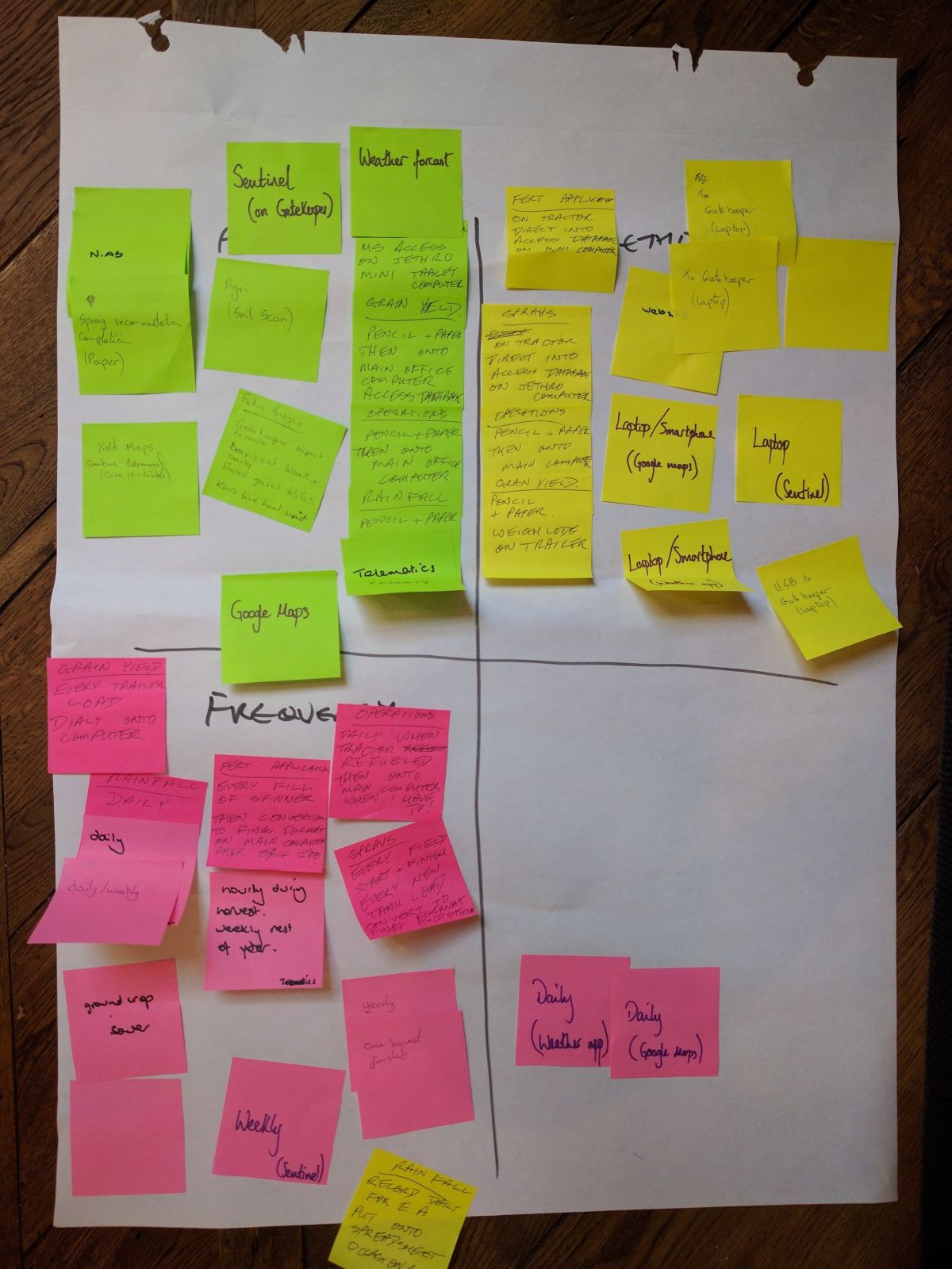
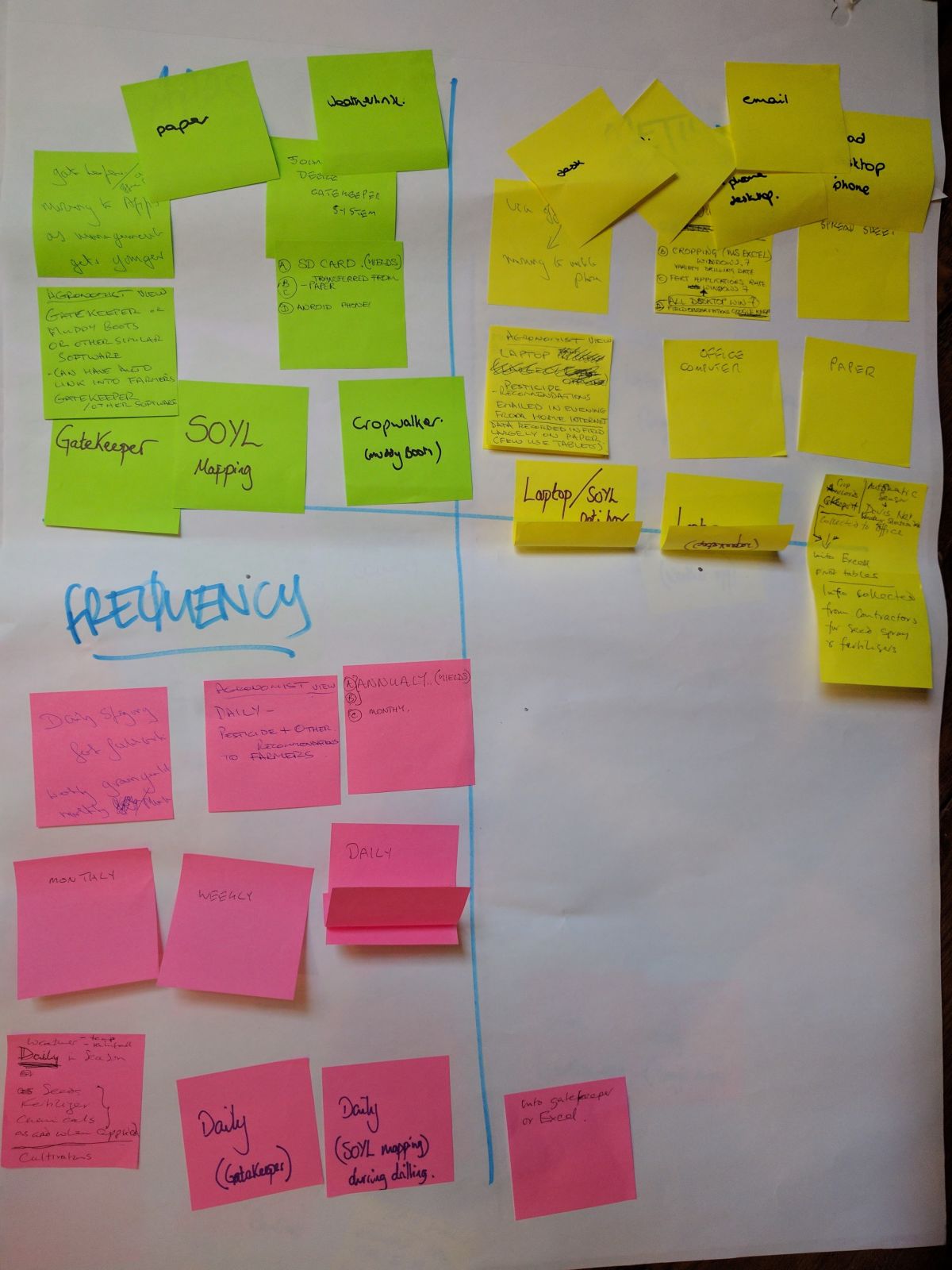
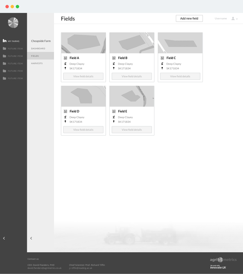
Beyond understanding technical literacy levels, I needed to map the actual workflows farmers used to record their operations. The workshop revealed fragmented, often analogue processes for tracking farm data. Some kept paper notebooks tucked in tractor cabs, jotting down seed varieties and planting dates. Others maintained spreadsheets, manually entering yield data after harvest. Soil sampling results arrived as PDF reports, filed away and rarely referenced again.
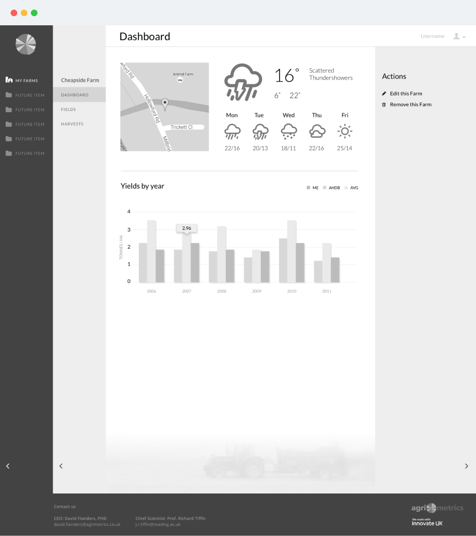
What struck me wasn't the lack of data, it was the lack of connection between data points. Farmers had information about their soils from testing labs, crop performance figures from harvest records, and field management notes scattered across formats. But nothing linked these together. They couldn't easily compare how different soil types affected yields, or which varieties performed best on their specific land. The data existed in isolation.
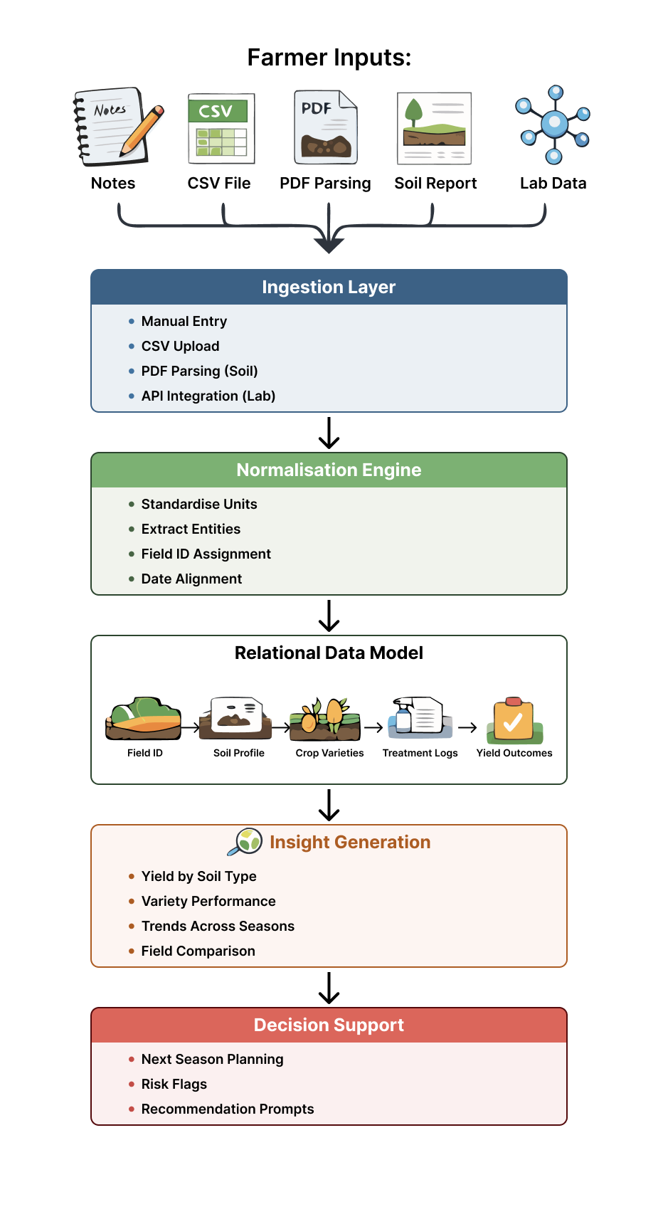
This insight shaped the platform's core value proposition: not just collecting data, but connecting it in ways that made individual records meaningful. I designed the information architecture around these actual farming workflows, ensuring the system could accept data in whatever format farmers already had it whilst automatically creating the relationships between soil characteristics, crop choices, and yield outcomes that had previously required hours of manual analysis.
Signup
User research revealed that existing agtech tools had conversion-killing onboarding flows requiring 15+ minutes of data entry before providing any value. For a pilot dependent on network effects, every signup abandonment was costly.
Engineering wanted comprehensive user data upfront for better analytics and personalisation. I pushed back, arguing that a lean signup optimised for conversion would generate more total data through higher user volume, even if individual profiles started incomplete.
I designed a progressive disclosure approach: 3 steps to create a usable field profile, then contextual prompts to enrich data during natural workflow moments. This reduced time-to-first-value from 15+ minutes to under 2 minutes.
This decision directly influenced pilot signup rates and became a template for subsequent onboarding flows across Agrimetrics' product suite, demonstrating how focusing on behavioural psychology over comprehensive features drives adoption.
Early wireframes
Wireframing revealed a systems design challenge: the platform needed data from farmers to provide value to farmers, creating a chicken-and-egg problem. How do you provide valuable comparisons without existing data? This was the central tension in creating a national data infrastructure. The vision was integration and interoperability of software tools and datasets across UK agriculture, providing consistent, national-scale analytics. But you can't analyse what doesn't exist yet.
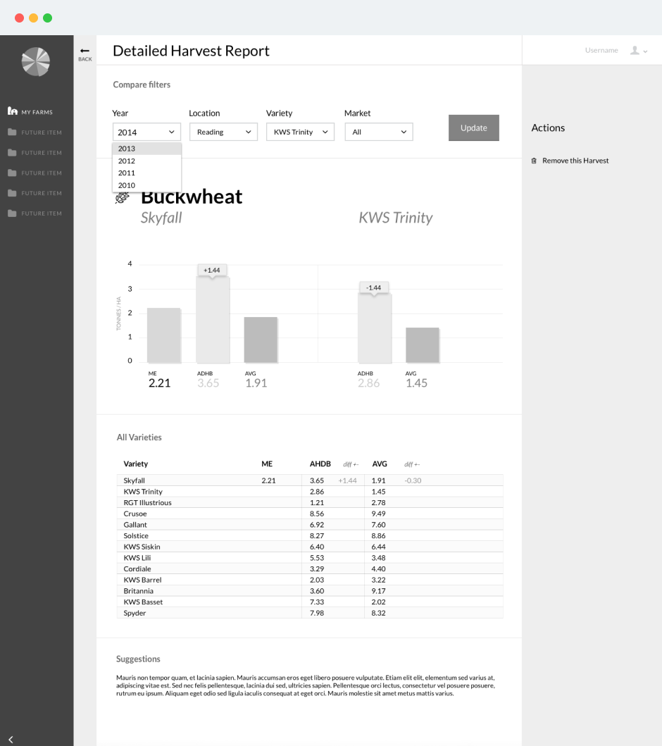
The solution required solving the cold start problem with external data sources. Working with the data science teams at Reading and Rothamsted, I integrated open source soil APIs that provided baseline field characteristics without requiring farmer input. This meant new users landed in a platform already populated with actionable data about their fields. They could explore soil variations across their acreage immediately, creating value before entering a single crop record.
These APIs became the foundation layer upon which farmers built their proprietary data. Instead of staring at empty forms demanding information, they saw their fields visualised with real environmental context. This approach transformed the first-use experience from "I need to do work before this is useful" to "This already knows something valuable about my farm." Strategically, it also meant I could start delivering on the promise of Big Data insights from day one, even with a small pilot cohort.
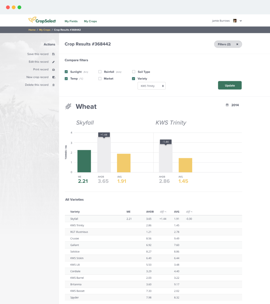
I designed the information architecture to provide immediate individual value before requiring participation in the collective benefit. This sequencing was critical: farmers would invest in data entry for personal ROI before contributing to the network. But farmers were protective of their proprietary yield data, commercial information they'd never shared before. Rather than hiding anonymisation in terms of service, I made it a visible UI element in comparison views, showing farmers exactly what others could and couldn't see about their data. This transparency became a trust-building feature that addressed the primary adoption concern.
These architectural decisions weren't just about interface layout; they solved the core business model challenge of building a multi-sided platform that needed to serve individual farmers, national policy objectives, and the broader research community simultaneously.
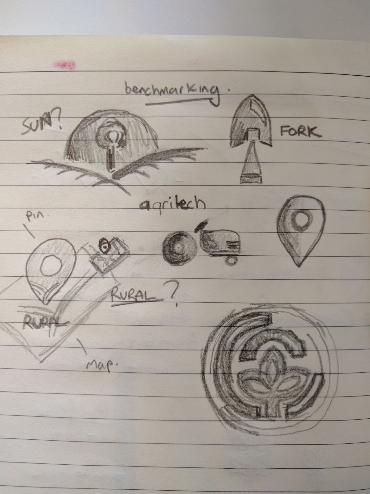
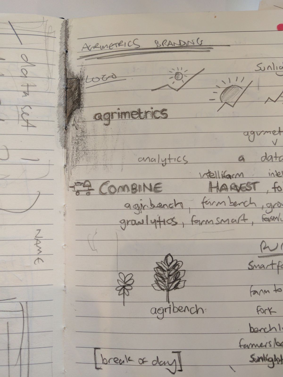
Phase 2 concepts
Visual refinement wasn't about aesthetics, it was about establishing credibility in a market where farmers were sceptical of "Silicon Valley" solutions. The branding and style guide communicated trustworthiness and professionalism to a conservative audience whilst maintaining the accessibility principles established earlier.
This visual language needed to work across diverse contexts: field use on tablets, office desktop analysis, and trade show demonstrations. The design system balanced polish with pragmatism, ensuring the platform looked legitimate to institutional buyers whilst remaining approachable to individual farmers.
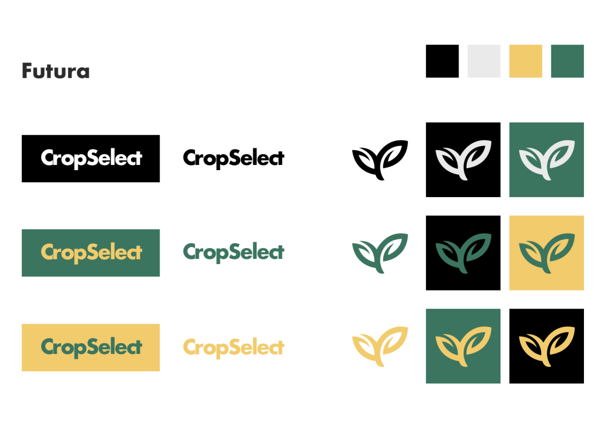
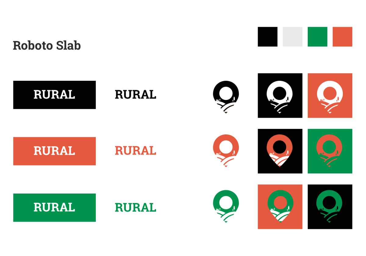
Logos
A selection of logos that I created as part of the branding exercise.
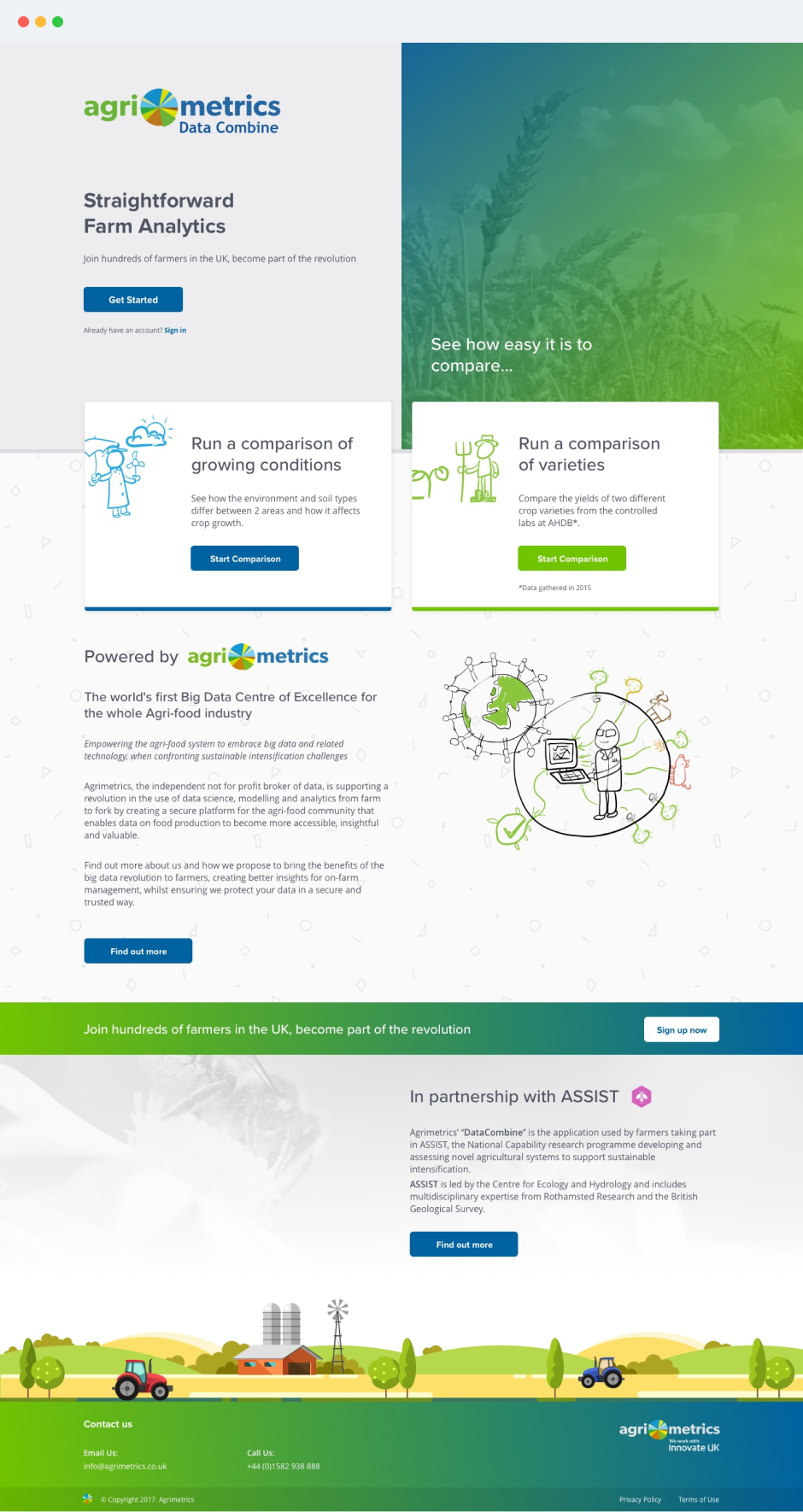
Marketing site
The marketing site solved a conversion problem: how do you explain a data platform to an audience sceptical of technology? Rather than leading with features or technology, I designed the landing page around farmer outcomes: yield improvement, crop selection confidence, and peer benchmarking.
Including working demos of the comparison tools on public pages served dual purposes: it demonstrated real functionality whilst educating users before signup, reducing confusion and support burden post-registration.
This "show, don't tell" approach respected farmers' pragmatism, they could evaluate utility before committing time to onboarding, qualifying leads and improving signup-to-active-user conversion.
Results
The pilot achieved higher-than-projected farmer enrolment, demonstrating genuine appetite for accessible farm data tools when designed correctly. Positive demo reception included unsolicited endorsement from then-Environment Secretary Michael Gove at the Royal Norfolk Show, who specifically praised the platform's accessibility. That validation of our "design for the least digital-literate" principle came not from tech evangelists or innovation advocates, but from farmers themselves and the policymakers who understood their needs.
The simplified onboarding reduced signup abandonment by eliminating the previous 15+ minute barrier, directly contributing to user acquisition goals. More significantly, it proved that progressive disclosure could work in agricultural contexts where comprehensive data collection had been considered mandatory. The anonymised comparison feature achieved critical mass for meaningful benchmarking, creating network effects that increased platform value with each new farmer. Watching farmers voluntarily contribute their most sensitive commercial data because they trusted how it would be used and what they'd get in return validated months of careful trust-building through design.
The design patterns, component library, and UX principles I established became templates for subsequent product development across Agrimetrics' broader platform work. The 3-step onboarding flow, in particular, influenced how other agricultural data tools approached farmer signup, showing the sector that simplicity wasn't dumbing down, it was respecting users' time and expertise.
Most importantly, the project demonstrated that British farmers would embrace digital tools when those tools were built for them, not at them. By solving the behaviour change problem rather than just building features, I proved that thoughtful UX design could be the difference between a theoretically brilliant platform that nobody uses and a nationally significant data infrastructure that farmers actually want to engage with.
" Crop Select demonstrates the power of the platform. As more farmers use it it will build up a good picture of how varieties perform on different soil types, creating a 'Trip Advisor' for crops. "

