BrightHR - Custom Reporting
One of the most challenging design problems I worked on was redesigning BrightHR’s reporting capabilities to support flexible, custom report generation for small and medium-sized businesses.
Tools
- Figma
- Pendo
Deliverables
- UX
- Visual Design
- Quant/Qual Research
The Problem
BrightHR originally offered a lightweight reporting feature that generated pre-defined reports for areas such as absences, timesheets, and employee data. Users could apply basic filters such as date ranges, but the structure of the report and the columns available were fixed.
For many customers, this quickly became a major limitation.
At the time, BrightHR did not provide a public API, meaning customers relied entirely on built-in reports to extract operational data. When those reports didn’t meet their needs, customers were forced to export full company datasets and manually manipulate them in spreadsheets.
Customer feedback consistently highlighted the same issue. Users needed the ability to generate reports for specific employees, teams, or absence types, but the system could only produce organisation-wide outputs.
While the initial sample I analysed showed over 50 requests specifically asking for employee-level filtering, this represented only a small subset of the demand. BrightHR typically received around 1,000 pieces of product feedback each month, and reporting flexibility had become the single most requested capability across the platform. In Pendo alone, the request for custom reporting accumulated 962 votes, many accompanied by detailed comments describing the need for greater flexibility in report structure, filtering, and data selection.
In some cases this wasn’t simply inefficient. Managers were exporting organisation-wide employee datasets simply to analyse one individual’s absence history, unnecessarily exposing sensitive employee information.
The challenge therefore wasn’t simply improving a reporting interface. It was designing a system that allowed non-technical HR users to construct flexible reports from complex workforce data.
Discovery & Research
Research for the feature began in October 2022.
As Design Lead, I created a research plan to better understand how customers were using reporting data and where the existing system was failing. I launched a quantitative in-product survey using Pendo, allowing active BrightHR users to share how they currently generated reports and what information they needed most often.
This research helped us identify:
- the most frequently accessed HR datasets
- the types of filtering customers required
- how users were currently working around reporting limitations
Alongside this work, I collaborated closely with engineering to map the data relationships across the BrightHR platform, including employee records, absence logs, team structures, and employment data.
Because the reporting solution would allow users to select from a large number of possible data fields, it was also important to design a clear and intuitive way to organise these fields in the interface.
To achieve this, I ran card sorting sessions to categorise the different types of HR data available across the platform. This allowed us to group fields into logical categories such as employee details, absence data, employment information, and document records.
The outcome of these sessions informed the information architecture of the report builder, ensuring that customers could easily locate and understand the different data fields when constructing reports.
Prototyping & User Testing
In January 2023, I moved into a prototyping and validation phase.
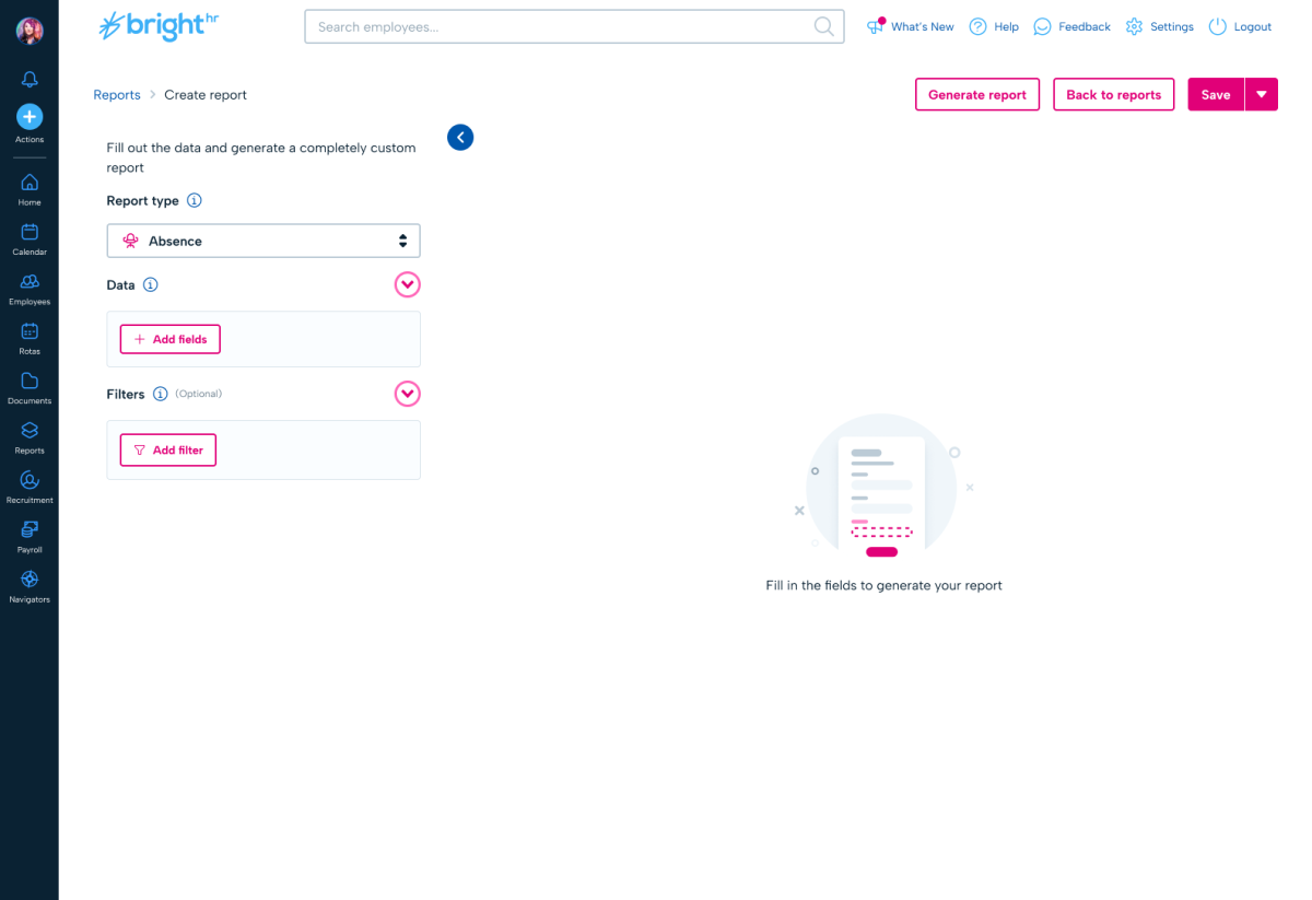
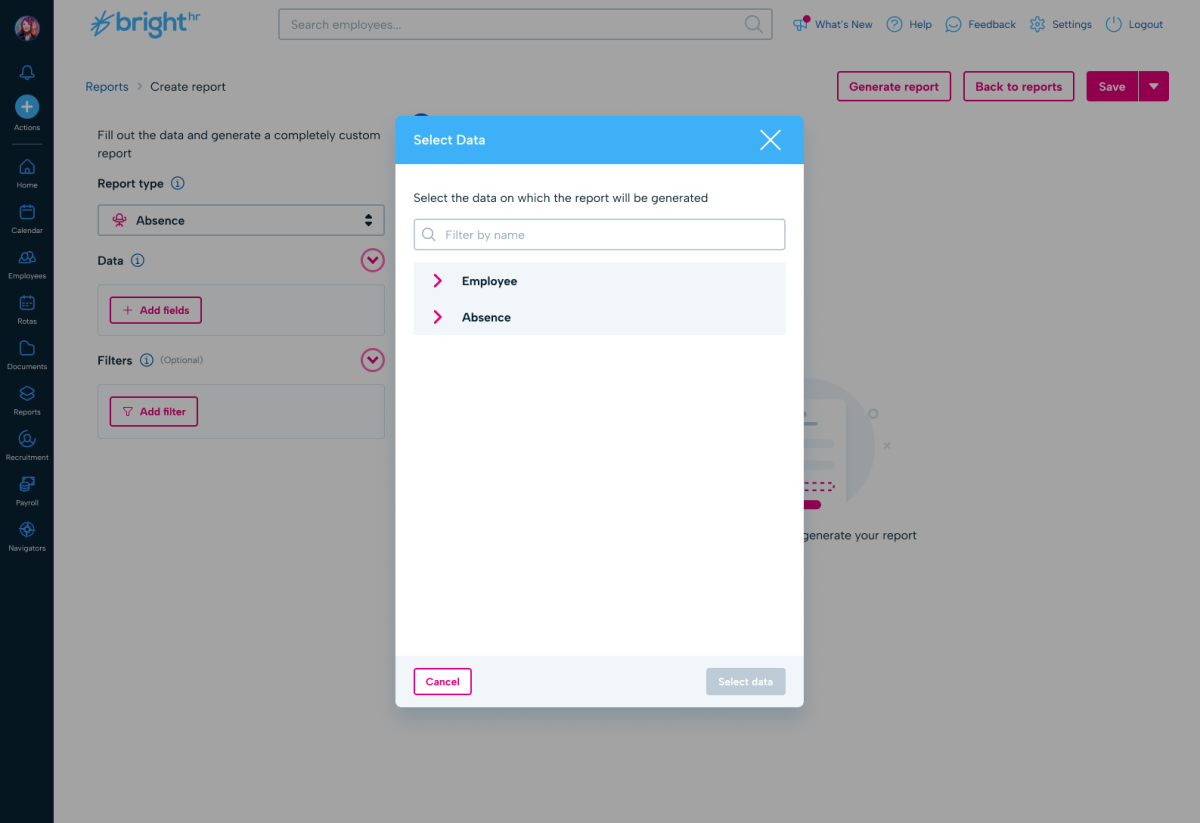
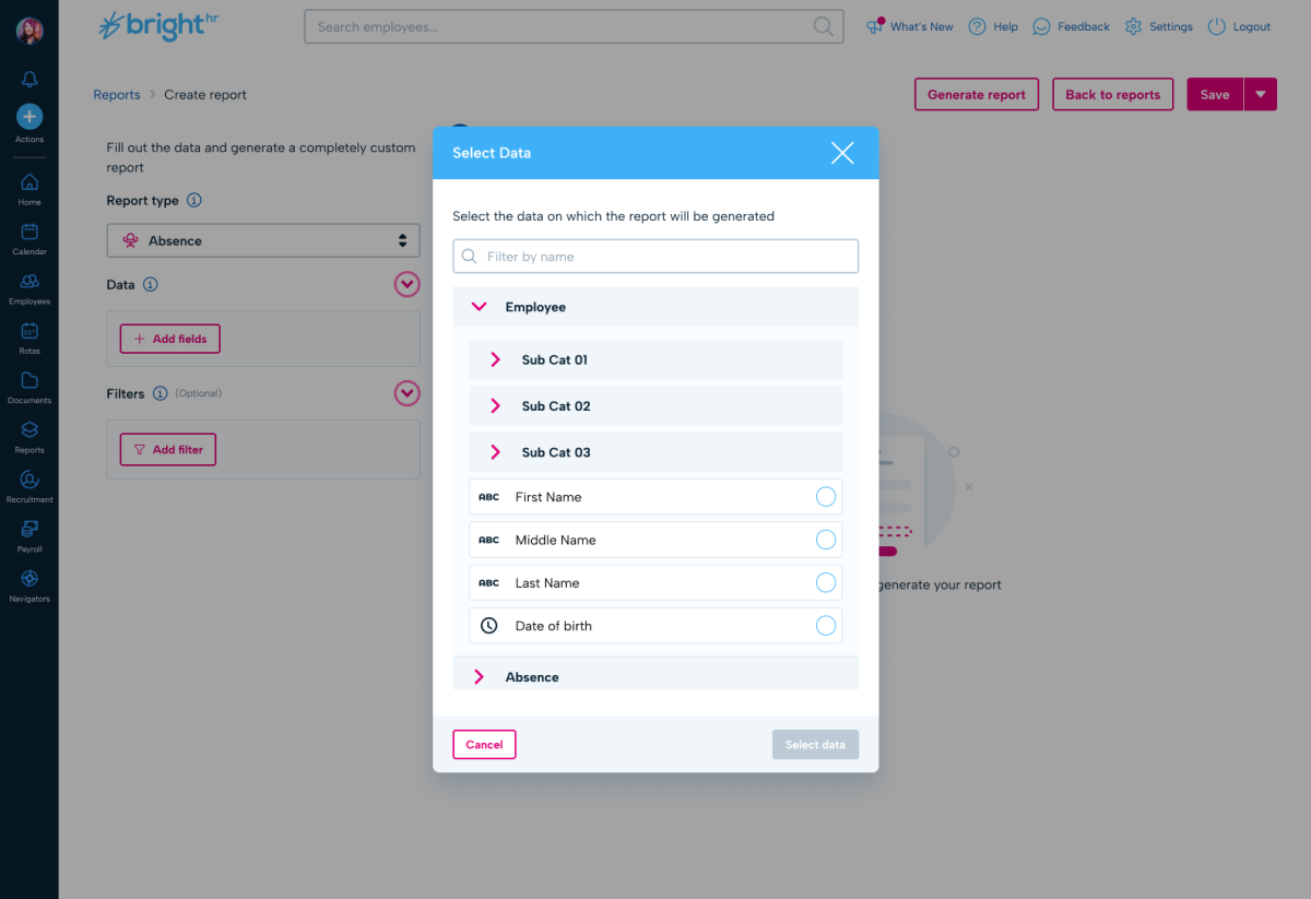
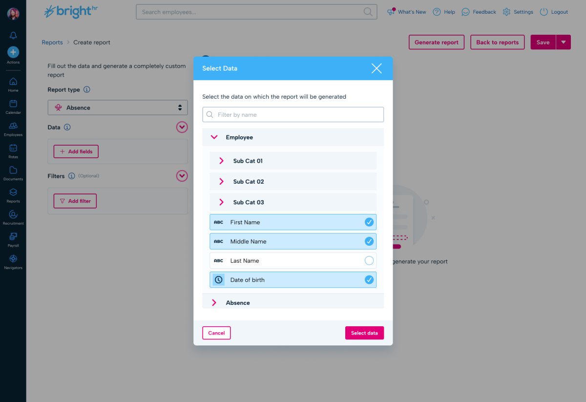
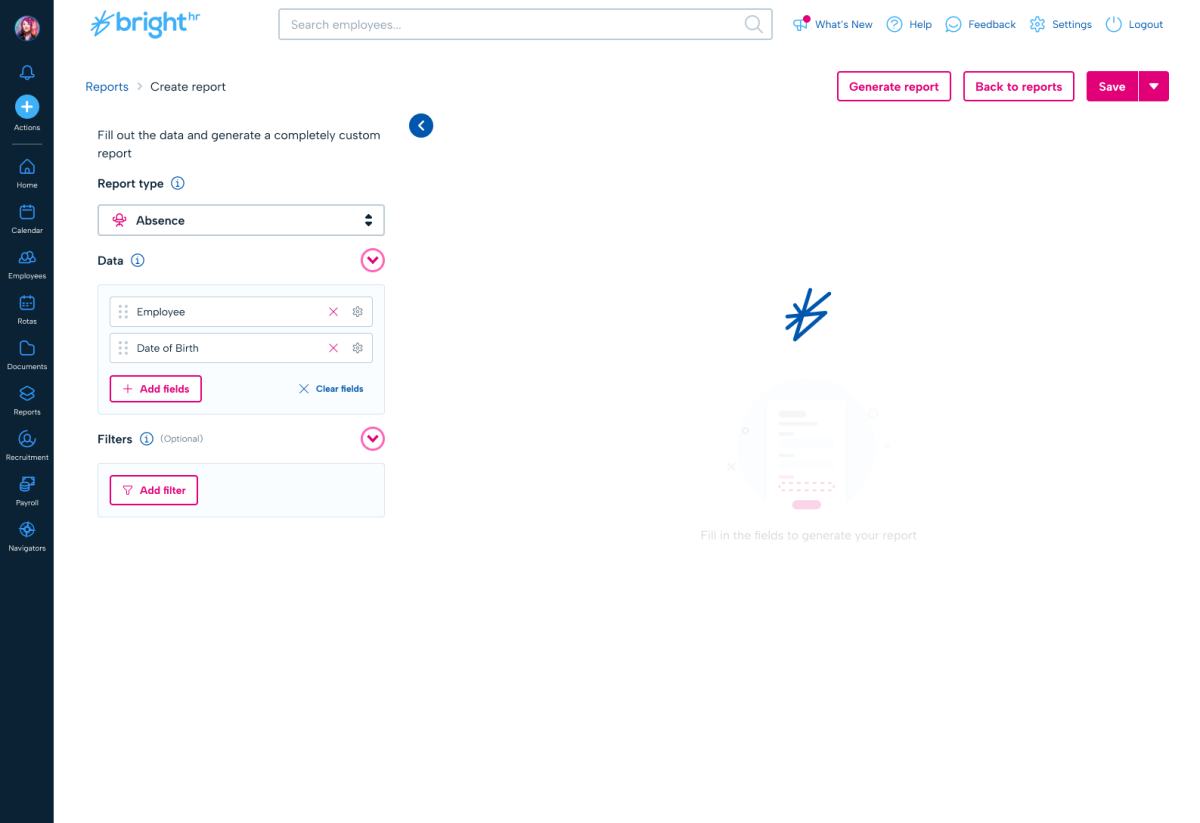
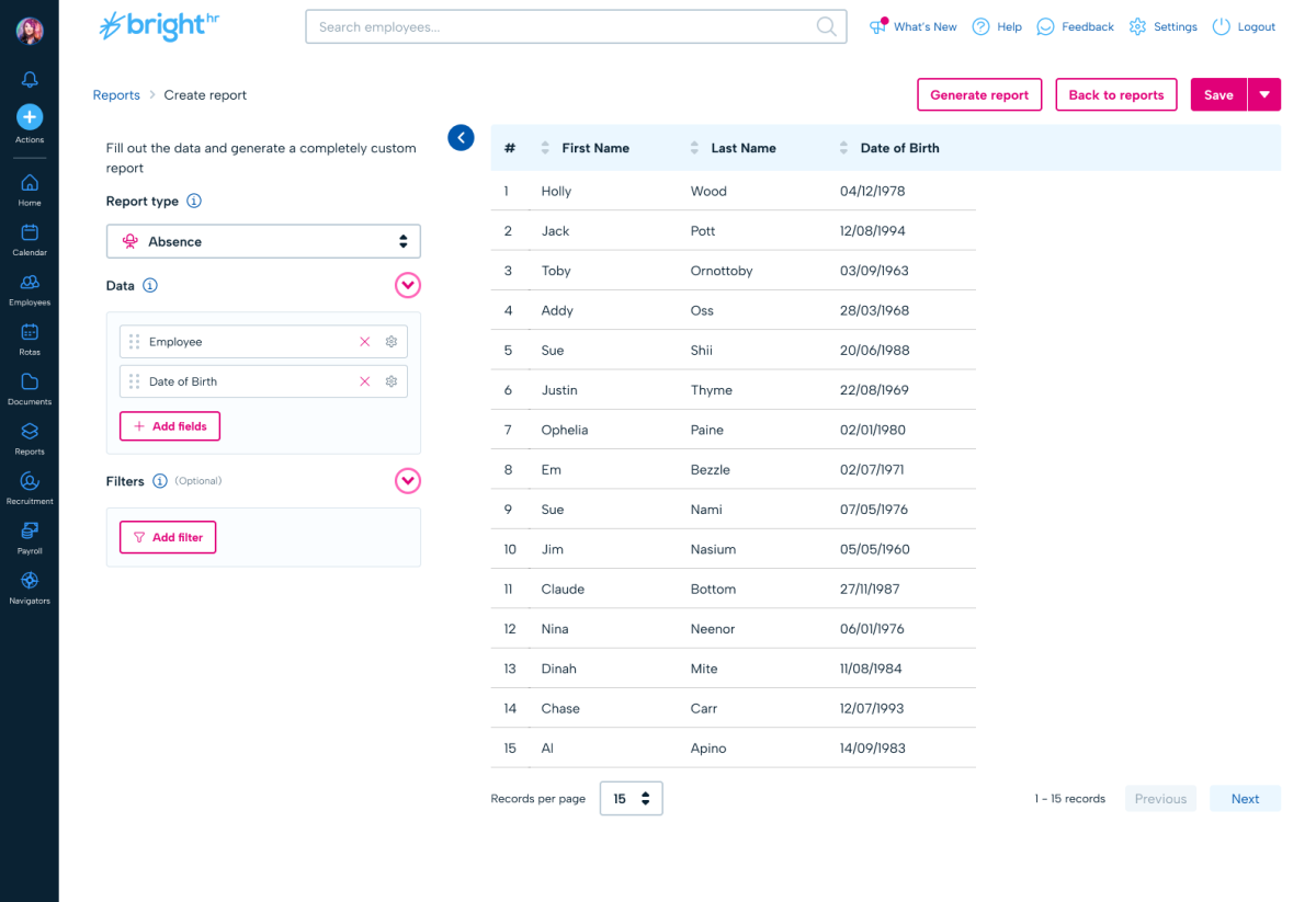
Using my own coding skills in HTML, Tailwind, and JavaScript, I scaffolded a lightweight prototype that simulated the core reporting experience using mocked datasets. The prototype allowed users to select data fields, apply basic filters, and see how the reporting system would behave.
Although the dataset was limited, this prototype demonstrated the speed and responsiveness of the reporting concept and allowed customers to experiment with filtering and field selection in a realistic environment.
To validate the design further, I wrote a secondary research plan focused on testing key assumptions we had recorded in Jira.
Two forms of testing were conducted:
- Moderated user testing sessions with BrightHR customer advocates, allowing us to observe how HR users approached report construction and filtering.
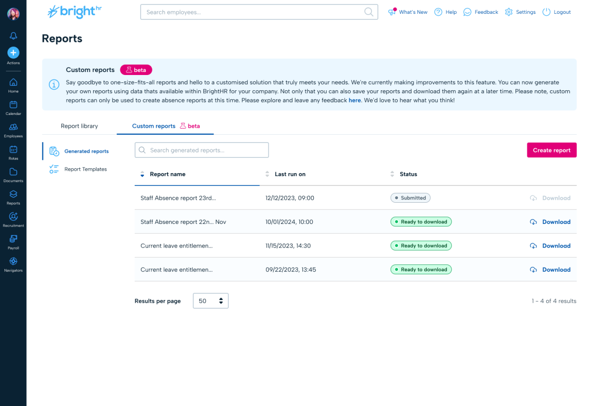
- Task-based usability testing on UserTesting.com, using interactive Figma prototypes to evaluate specific workflows such as selecting data fields, applying filters, and generating reports.
This testing allowed us to close the loop on several design assumptions and confirm that users understood the mental model of building reports from selectable data fields.
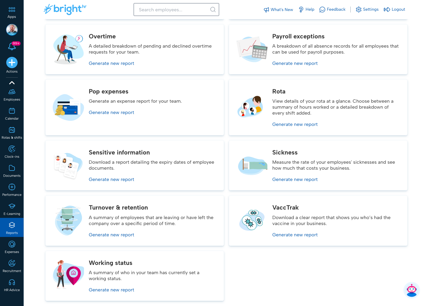
The prototyping and testing phase was highly successful and gave the team confidence to move forward with the production implementation.
The Solution
I designed a custom report builder that allowed customers to construct reports dynamically rather than relying on fixed outputs.
The feature launched on 16 June 2023 across the UK, Ireland, Canada, and ANZ markets, ensuring the reporting capabilities were available across BrightHR’s core international customer base.
The core concept behind the solution was enabling users to assemble reports directly from the underlying BrightHR data model.
Flexible dataset construction
Users could select exactly which data fields to include in their report, effectively constructing their own dataset from BrightHR’s employee and operational data.
Rather than relying on rigid, pre-defined reports, customers could generate reports containing only the columns relevant to their needs. As reporting requirements evolved, additional fields could be layered onto the dataset, allowing customers to progressively expand their reports without needing to recreate them from scratch.
This allowed customers to create truly flexible reports, tailored to their specific operational questions.
Live report preview
A key part of the experience was a live report preview that updated as users added fields or applied filters.
As customers configured their report, the dataset would update instantly so they could immediately see how the report output would look. This allowed users to iterate quickly, refine their dataset, and validate the structure of the report before generating or downloading it.
Advanced filtering
Reports could now be filtered by:
- specific employees
- teams
- absence types
- custom date ranges
These capabilities directly addressed the most common reporting requests identified during discovery.
Reusable report templates
Once configured, reports could be saved as templates. Customers who regularly generated the same operational reports could quickly regenerate them without rebuilding the dataset each time.
Rebuilding the reporting engine
An additional benefit of introducing the new reporting engine was that we were able to retire the legacy reporting templates.
The previous fixed reports were effectively rebuilt using the new reporting system and provided as ready-to-use templates. Customers could use these as a starting point and then customise them further by adding fields, filters, or additional data columns.
This allowed the platform to support both:
- quick access to common reports, and
- fully flexible custom reporting
while simplifying the overall reporting architecture.
Technical architecture
To support this level of flexibility and responsiveness, the reporting system was powered by a GraphQL query API operating against a replicated production database.
Running reporting queries against a replicated dataset ensured that generating reports would not impact the performance of the core application or other parts of the platform.
This architecture allowed customers to explore large datasets interactively while maintaining system stability across the wider product ecosystem.
Impact
The feature saw strong adoption following its release.
Since launch, analytics show:
- 43,000 users interacting with the custom reporting feature
- 2.2 million reporting-related events
- 118,000 reports generated
- 100,000 report downloads
User behaviour also validated the core design decisions behind the reporting builder. There were over 225,000 interactions with the “Add fields” function, demonstrating that customers were actively constructing custom datasets rather than relying solely on pre-configured reports.
Filtering capabilities for specific employees and teams were also widely used, confirming that the feature directly addressed the most common customer pain points identified during research.
Adoption was strongest in BrightHR’s largest market, the United Kingdom, which generated approximately 2 million reporting events. Significant usage was also observed across other launch territories including Australia (166K events), Canada (136K), Ireland (127K), and New Zealand (16K), confirming that the feature was successfully adopted across BrightHR’s international customer base.
Operationally, the feature reduced the need for customers to export raw datasets and manually manipulate reports in spreadsheets, allowing them to extract targeted insights directly within the product.
Across the dataset, the average user triggered approximately 50 reporting interactions, indicating that reporting had become a repeat operational workflow rather than a one-off task.
Why It Was Challenging
This was one of the most complex design challenges I’ve worked on because it required solving problems across multiple layers.
First, it was fundamentally a data modelling problem, not just an interface problem. The reporting system needed to reflect complex relationships between HR datasets in a way that remained intuitive.
Second, the system had to be accessible to non-technical HR users, many of whom had limited experience working with structured data.
Finally, the solution needed to balance flexibility with simplicity. Too much complexity could overwhelm users, while too little would recreate the limitations of the original reporting system.
Designing an experience that provided power without complexity was the core challenge.
Optional Future Improvements
If I were revisiting this feature today, there are several ways I would extend the reporting system to make it even more powerful and accessible.
Natural language reporting queries
Introducing natural language queries would allow users to generate reports simply by asking questions.
For example:
"Show me sickness absence for warehouse staff in the last six months."
The system could interpret the query, apply the relevant filters, select the appropriate data fields, and automatically generate the report.
AI-generated report templates
AI could generate suggested report templates based on common HR workflows or usage patterns within the platform.
Scheduled report automation
Reports could be automatically generated on a daily, weekly, or monthly basis and delivered via email or notifications.
Live reporting dashboards
Customers could pin live reporting tiles showing key metrics and visualisations directly to a dashboard.
Instead of generating full reports each time, customers could monitor operational insights at a glance, such as:
- absence trends
- upcoming probation reviews
- expiring right-to-work documents
- team-level attendance metrics
This would shift reporting from a static export workflow to a continuous insight experience.