
Update, June 2026: Since this article was written, Figma have made two significant announcements ahead of Config Conf 2026. First, Figma Make can now connect directly to your codebase — ship features from design to production without leaving Figma. Second, and more directly relevant to everything argued here: Figma Agent is now live on the canvas. It lives natively in the sidebar, understands your design system, components, and tokens without any setup, and works directly on your files — bulk editing components, applying system standards at scale, swapping variants, and iterating on designs without context-switching. This is exactly the multiplier this article was pointing toward. I wrote more about both announcements on LinkedIn.
On 24 March, Figma quietly published something that most people in product teams probably scrolled past: write access to the Figma canvas via MCP. Agents can now read and build directly inside your actual Figma files.
On 9 April, at our UX Guild day, that was the thing I wanted to get the team’s hands on.
There’s been some honest pushback on AI-assisted design in our team, specifically around the idea of prototyping or designing directly inside an IDE or working against the webapp codebase. That’s fair. Most of our designers live in Figma. Pulling them out of that environment to work somewhere less familiar creates friction and erodes the flow that good design depends on.
The Figma MCP approach sidesteps that entirely. You’re not leaving the canvas. The agent works inside the same file, using the same components and tokens you already design with. You can literally watch it happen: another avatar appears in the top-right corner of Figma, the same way a collaborator does when they join your file. It moves around the canvas, places frames, drops in components. The best way I’ve found to describe it is having another designer sitting next to you, sharing your mouse, who already knows the design system inside out.
That multiplier framing is what drove the session. Not “how do we get designers to write code” but instead “how do we make the tools designers already use significantly more powerful.”
The prompt I set the team was simple: what if an AI could build a screen from our design system without any hand-holding?
Not generate something plausible. Actually use our real Lumen components, our real tokens, our real layout conventions, and produce something a developer could ship.
To get there, I had to do two things in parallel: teach the AI about our design system, and fix the design system so it was worth teaching.
The Problem with How We’ve Been Documenting Design Systems
Storybook is great. Zeroheight is great. Notion pages, Confluence, design tokens spreadsheets. All useful in their context.
But here’s the thing none of them were built for: being read by a machine at the moment it’s making a decision.
When a developer opens Storybook, they’re doing active research. They have time to read, click around, cross-reference. When an AI agent is building a screen in Figma through MCP, it’s in the middle of executing a task. It needs the answer right now, in the context it already has, without a round-trip to an external doc site.
That’s a fundamentally different consumption model, and it means our documentation needs to live somewhere new.
Mike Davidson, who runs the largest design team at Microsoft AI, published something worth reading alongside this last week. His framing: the assembly layer of design is going away. The repeatable, specification-level work most of us do some percentage of. Hover states written for the thousandth time. Survey data tagged line by line. Token documentation that lives untouched in a Notion page nobody visits. I’d call it the busy work.
Few designers do none of it. But those tasks are exactly where AI is moving first. What that shift actually does is something more interesting than just saving time: it stops your intelligence being spent on mediocre work and redirects it toward the parts of design that actually require thinking. The strategy, the taste, the ability to define what an AI should know about your product. Building design system documentation that a machine can actually use sits squarely in that territory.
SKILL.md Files: Version-Controlled Design System Documentation
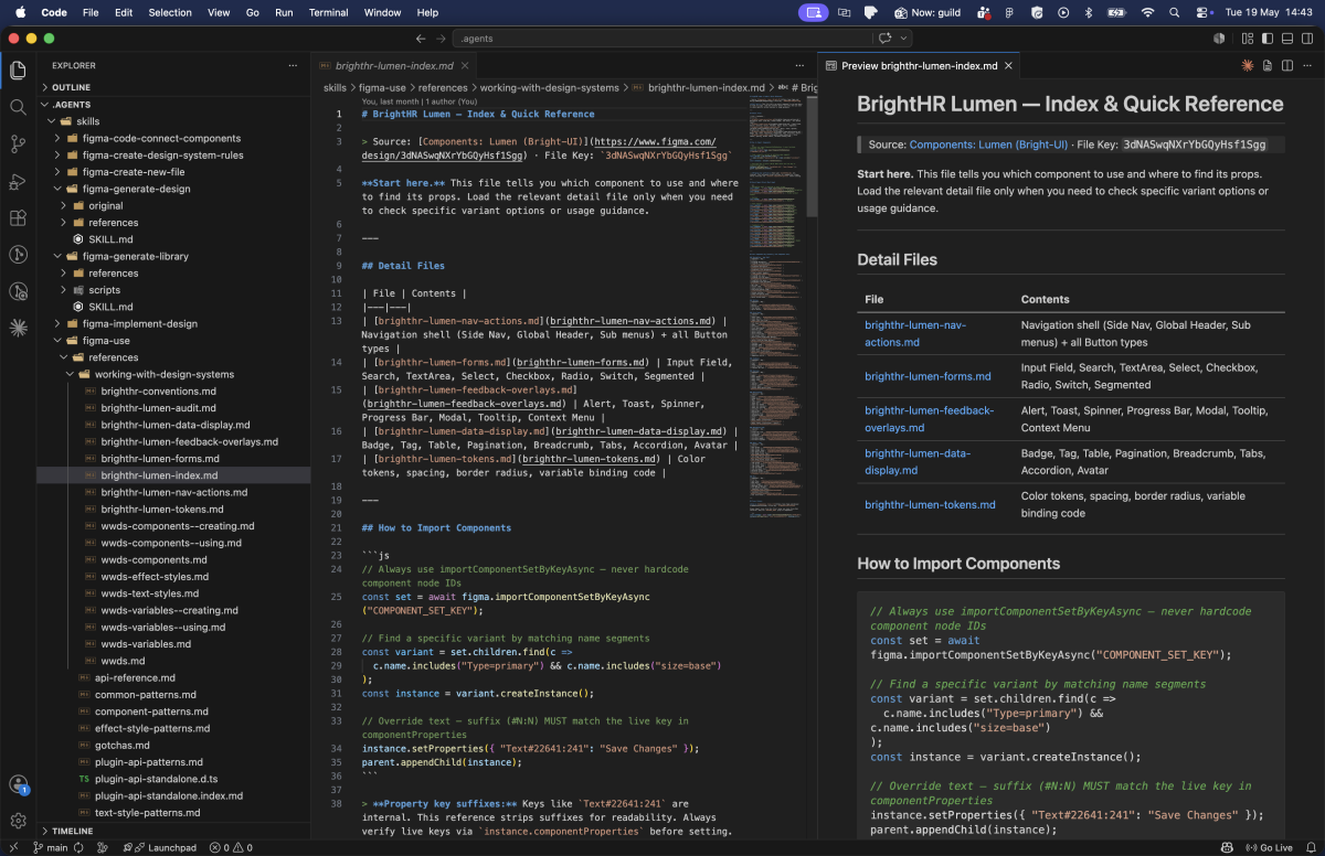
The approach I’ve settled on is this: design system documentation (components, tokens, patterns, typography) lives in SKILL.md files, in their own version-controlled repository.
Not in Notion. Not in Zeroheight. Not in a Figma comment.
A SKILL.md file is a structured markdown document that an AI agent loads at the start of a task. It’s the difference between an agent that knows your design system and one that guesses.
Keeping them in a separate repo means designers can clone it once and point Claude Desktop or VS Code at the local folder. New components get documented in the same place, the history is tracked, and everyone on the team is working from the same reference.
Figma’s own Code to Canvas workflow lab describes skills in exactly these terms: reusable instruction sets stored as text files, loaded on demand when an agent needs to execute a specific task. The terminology landed independently on the same idea, which tells you something about where this is heading.
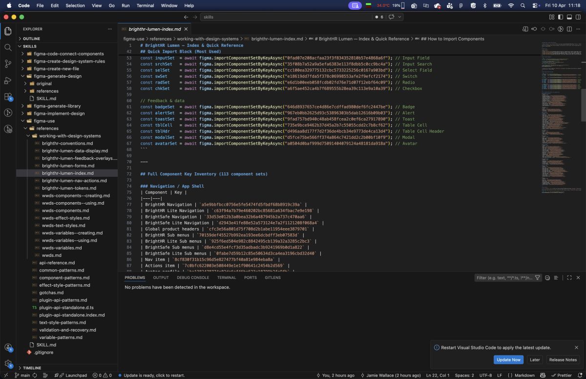
For BrightHR, I built a reference set that covers:
brighthr-lumen-index.md: the entry point, every one of our 113 Lumen components with their import keys and a navigation guide to the detail filesbrighthr-lumen-nav-actions.md: navigation shell and all button variants with full prop tablesbrighthr-lumen-forms.md: every input component, fields, search, selects, checkboxes, radio groups, switchesbrighthr-lumen-feedback-overlays.md: alerts, toasts, modals, tooltipsbrighthr-lumen-data-display.md: badges, tags, tables, pagination, tabs, accordionsbrighthr-lumen-tokens.md: the full colour token catalogue with scopes, spacing, border radius, and variable binding code
These aren’t long documents. Each one is 4–9KB. They’re designed to be loaded on demand: an agent building a form loads forms.md, not the entire reference. That constraint forced a discipline that frankly made the documentation better for human readers too.
The original version was a single 42KB, 1161-line file. It was comprehensive and completely unusable. Breaking it apart by domain made the structure legible. It’s a good reminder that good documentation architecture isn’t just about where things live. It’s about how a reader (human or machine) navigates to what they need.
What the Figma Side Taught Me
Building this reference required walking the entire Lumen library through the Plugin API, enumerating component sets across 45 pages, pulling componentPropertyDefinitions, variant counts, prop types. It’s the kind of survey work that would take a designer days to do manually.
That process surfaced something uncomfortable: a lot of our components were poorly described, or not described at all. And it turns out that matters enormously when an AI is trying to use them correctly.
Descriptions Everywhere
When Claude reads our Figma file through MCP, it sees the same data as Dev Mode. That means component descriptions, text style descriptions, effect style descriptions. They all surface as context.
A component with no description is a component the AI has to guess the intent of. A component with a description like:
“Primary action button. Use for the single most important action on a page. Never use more than one per view.”
…gives the AI a constraint it can actually act on. It won’t drop two primary CTAs onto a screen just because the design called for two actions.
This isn’t just useful for AI. It’s useful for junior designers, for accessibility audits, for onboarding. The description field has always existed. We’ve just been leaving it empty in Figma and documenting it elsewhere.
Variable Scopes Are Semantic Contracts
This one caught me off guard. When you create a variable in Figma and leave the scope at the default ALL_SCOPES, that token shows up in every property picker: fills, strokes, text, gaps, radii, everything. It’s noise.
More importantly, MCP can’t infer where a token should be used from its name alone. A token called color/bg/primary might look self-explanatory to a human, but an AI needs the explicit signal: this is a FRAME_FILL and SHAPE_FILL scope. It is not a TEXT_FILL. It is not a font size.
Explicit scopes create semantic contracts. They tell the AI, the Figma UI, and any developer reading the tokens exactly what a variable is for. When I added specific scopes to the BrightHR token catalogue, the AI’s token selection went from “probably right” to “precisely correct.”
Davidson’s piece made the same point from a hiring angle: the designers teams are looking for right now take token design just as seriously as pixel design. Not because it’s glamorous work, but because the designers who understand it are the ones who can direct an AI to produce something unambiguously correct rather than something that’s probably fine.
Naming Conventions Are Hierarchy
Slash-delimited paths aren’t just a style preference. color/bg/primary, spacing/lg, border-radius/md: these create a tree structure that AI tools can parse and reason about.
More critically: semantic variables should always alias primitives, never hold raw values.
color/bg/primary should point to primitive/blue/500, not to #1D4ED8. If it holds a raw value, a tool reading the token has no way of knowing it’s related to any other blue in the system. The alias chain is the relationship graph. Without it, your token system is just a list of named hex codes.
This is a design system fundamentals point that’s been true for years, but AI tooling makes the cost of getting it wrong much more immediate.
What This Looks Like in Practice
Getting the design system infrastructure right is only half the picture. The other half is teaching designers how to write prompts that actually use it.
The framework I walked the team through was TC-EBC, created by Greg Huntoon. It structures a prompt into five parts: Task, Context, Elements, Behavior, Constraints. Each line answers one specific question the model needs to make a decision. No narrative, no vague intent — just the things that affect output.
Applied to the Clock-in Management example:
Task:     Build a Clock-in Management dashboard
Context:  Post-login management screen in the BrightHR web app
Elements: Form panel (left), interactive map (right), primary submit CTA
Behavior: Form submission updates map markers; fields validate inline
Constraints: BrightHR Lumen design system, Primary tokens, 16px grid, desktop layout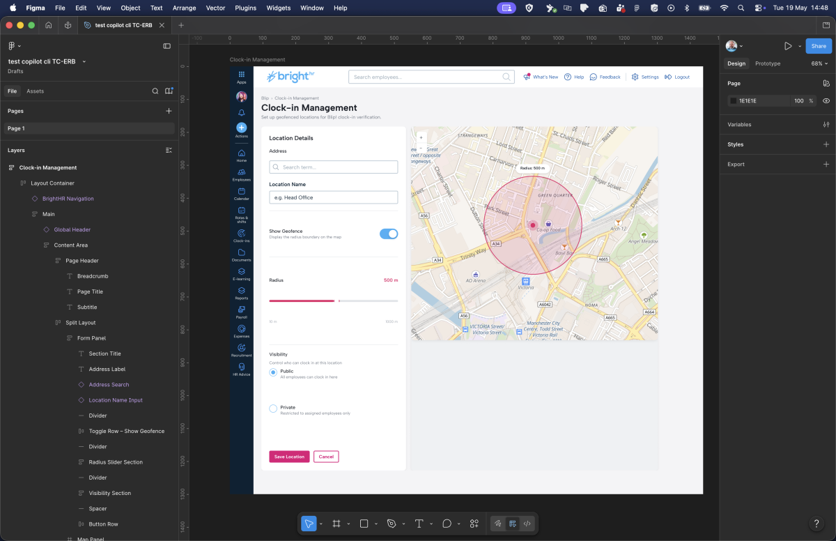
With this setup running, the agent can:
- Load
brighthr-lumen-index.mdto identify which components it needs - Load
brighthr-lumen-forms.mdto get the exact import keys and prop tables for the form inputs - Load
brighthr-lumen-tokens.mdto bind the right colour variables - Import components from the live Lumen library, not recreate them from scratch
- Produce a frame that a developer can inspect in Dev Mode and actually ship from
No hallucinated components. No approximate colours. No layout patterns that “look” like BrightHR but diverge from the actual system.
Figma’s workflow lab maps out three distinct modes for this kind of work: code-to-canvas prototyping, where rough vibe-coded designs get converted into proper structured layers; design system synchronisation, for keeping tokens in sync between Figma and code; and canvas-based exploration, which is what I’ve been describing here. The scaffolding gets handled. You spend the time on the work that requires a designer’s judgment.
What Design Teams Should Do Now
If you’re running a design system team and you want to be ready for this world, here’s where I’d start:
1. Audit your component descriptions. Open Figma, filter by components with empty descriptions. That list is your backlog. Prioritise the 20 most-used components and write one sentence of intent and one sentence of constraint for each.
2. Set explicit variable scopes. Go through your token collection and replace ALL_SCOPES with specific scopes for each token. It’s tedious once and correct forever.
3. Check your alias chain. Every semantic token should resolve to a primitive. If any token holds a hardcoded value, it’s a gap.
4. Start a SKILL.md for your design system. It doesn’t have to be comprehensive on day one. Start with your most-used components and your colour tokens. The discipline of writing it will surface gaps in your own understanding of the system.
5. Treat documentation as a first-class deliverable. Not a post-ship cleanup task. When a new component ships, its description, its scope, its usage constraints, and its entry in the SKILL.md file ship with it.
The Broader Point
Davidson describes the shift as everyone becoming a conductor. The machines play the instruments, as many of them as you want, as long as you know how to wave your arms. That’s a useful frame for what I’m describing here. The SKILL.md files, the variable scopes, the alias chains: none of that is the design work itself. It’s the score. When it’s right, the AI can play it. When it’s vague or missing, you get noise.
We’ve spent years building design systems that are readable by humans. The token naming, the component documentation, the usage guidelines. All of it was optimised for a designer opening Zeroheight on a Tuesday afternoon.
The consumers of our design systems are changing. AI agents are going to build screens from our systems. They’re going to check whether a component is being used correctly. They’re going to flag when a token is out of scope. They’re going to generate handoff notes, accessibility audits, and implementation briefs.
The design systems that will work well with those agents are the ones that were built to be unambiguous. Where every component has a stated intent. Where every token has an explicit scope. Where the hierarchy of relationships is encoded in the naming, not just implied by convention.
That’s not a different standard from what good design systems have always aimed for. It’s just a more urgent version of it.
The AI is already reading your design system. The question is whether it can understand it.